Analytics Dashboard
The Analytics page provides a chart-rich, read-only dashboard that surfaces trends, performance metrics, and patterns across your support system. All data is computed in real time from your existing tickets, team members, projects, and clients — no configuration required.
Role Access
Admin and Lead can view the Analytics dashboard. Member role cannot access it — they will see an “Access Denied” message if they navigate to /analytics directly.
Getting There
- Click Analytics in the sidebar (directly below Dashboard)
- Navigate to
/analytics
The Analytics link only appears in the sidebar for users with Admin or Lead roles. It is also available in the mobile menu in the same position.
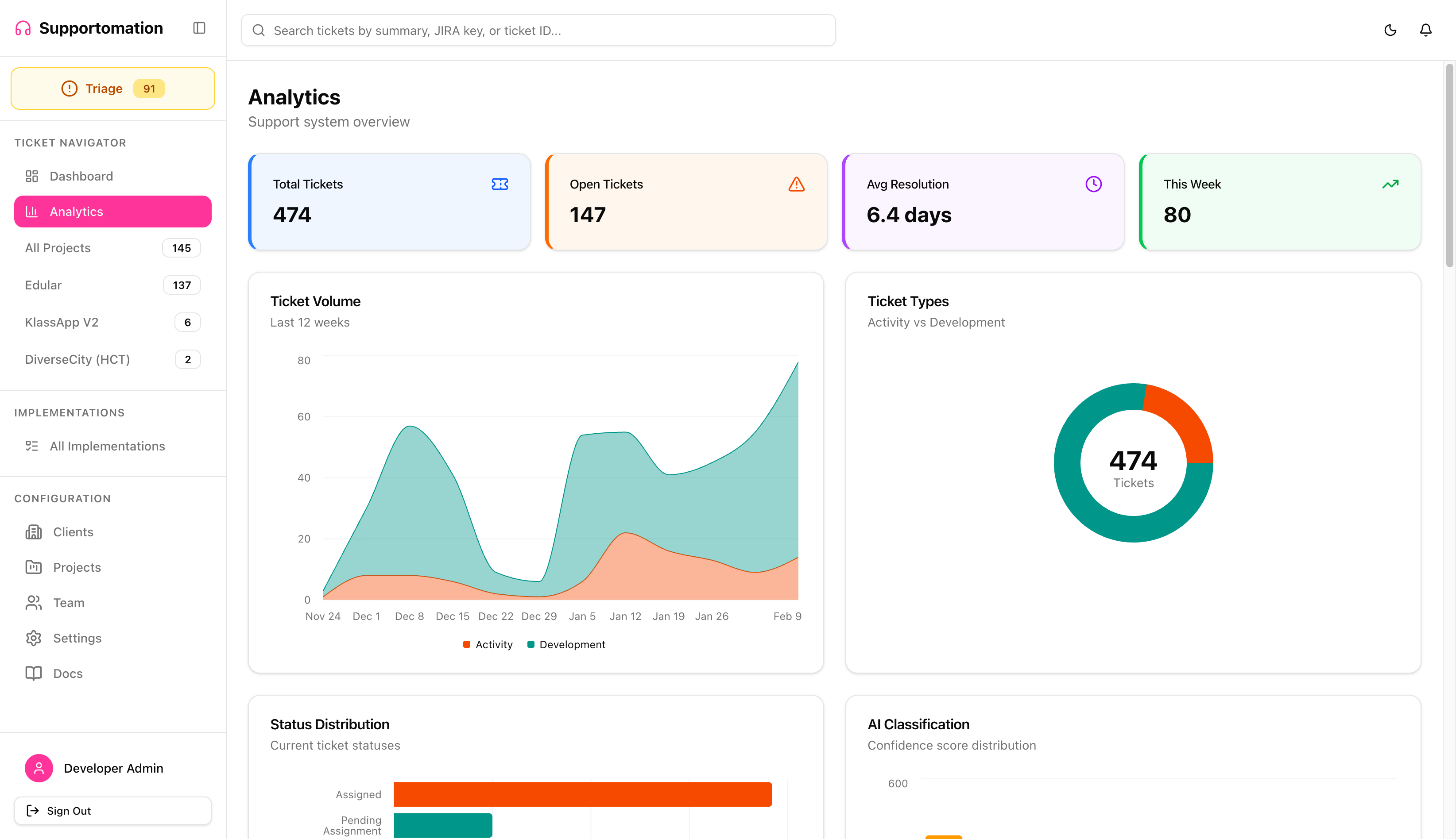
KPI Summary Cards
The top of the page displays four summary cards that give you an instant snapshot of your support system:
| Card | Description |
|---|---|
| Total Tickets | Count of all non-spam tickets across accessible projects |
| Open Tickets | Tickets that are not yet completed or resolved |
| Avg Resolution | Average number of days from ticket creation to resolution email (e.g., “6.4 days”) |
| This Week | Number of new tickets created in the last 7 days |
If there are no resolved tickets yet, the Avg Resolution card shows “0 days” without errors.
Charts
The dashboard is organized into five rows of charts, each focusing on a different aspect of your support operations. On desktop, charts display in a two-column grid layout. On mobile, they stack into a single scrollable column.
All charts support dark mode and automatically adapt colors when you toggle the theme.
Row 1: Ticket Volume & Types
- Ticket Volume — Stacked area chart showing Activity and Development ticket counts over the last 12 weeks. Hover any point for exact values.
- Ticket Types — Donut chart showing the overall split between Activity and Development tickets, with the total count displayed in the center.
Row 2: Status & AI Classification
- Status Distribution — Horizontal bar chart showing how many tickets are in each status (Assigned, Pending Assignment, On Hold, Requires Human, etc.).
- AI Classification — Bar chart showing the distribution of AI confidence scores across 10 buckets (0-9 through 90-100), with three summary badges below:
- Auto-assigned (confidence >= 90%) — green
- Manual Review (70-89%) — amber
- Requires Human (< 70%) — red

Row 3: Team Workload & Composition
- Team Workload — Grouped horizontal bar chart showing Support, Development, and Overdue ticket counts per team member. Helps identify overloaded members and available capacity.
- Team Composition — Two mini donut charts (Roles and Capabilities) plus an active/inactive/archived summary row.
Row 4: Projects & Clients
- Projects — Stacked bar chart showing Activity vs Development tickets per project.
- Top Clients — Horizontal bar chart of the top 10 clients ranked by ticket volume.

Row 5: Spam & Resolution Time
- Spam Detection — Stacked area chart showing legitimate vs spam email volume over 12 weeks. Below the chart, a list of the top 5 spam patterns (with type badges and match counts) provides actionable insight.
- Resolution Time — Line chart tracking average days to resolve tickets per week over the last 12 weeks.

Dark Mode
All charts adapt automatically when you toggle between light and dark themes using the sun/moon icon in the header.

Data & Access Control
Analytics data respects your client group permissions:
- Admin users see data across all clients and projects
- Lead users with restricted client group access only see analytics for clients and projects they have access to
All data updates in real time via Convex’s reactive subscriptions. When tickets are created, resolved, or reassigned, the charts reflect changes automatically.
Loading & Empty States
- While data is loading, chart cards display skeleton placeholders
- If a chart has no data (e.g., no resolved tickets for resolution time), it shows a “No data yet” message inside the card
Tips & Troubleshooting
| Issue | Solution |
|---|---|
| I don’t see the Analytics link in the sidebar | Your role must be Admin or Lead. Members cannot access Analytics. |
| Charts show less data than expected | If you are a Lead with restricted client groups, you only see data for your accessible clients. Ask an Admin to update your client group access if needed. |
| Resolution time chart is empty | This chart only shows data for tickets that have a resolution email sent. Tickets resolved without an email are not included. |
| Spam chart shows no spam | If spam detection is disabled in Settings, or no tickets have been flagged as spam, the chart will be empty. |
| Charts look wrong in dark mode | Try toggling the theme off and on again. Chart colors are tied to CSS variables that update with the theme. |
Next Steps
- Chart Reference — Detailed breakdown of each chart type and what it measures
- Dashboard — Return to the main Dashboard
- Ticket List — Browse and filter tickets directly
- Team Workload — View the simpler workload table in Team Management